Deviation Actions


Description

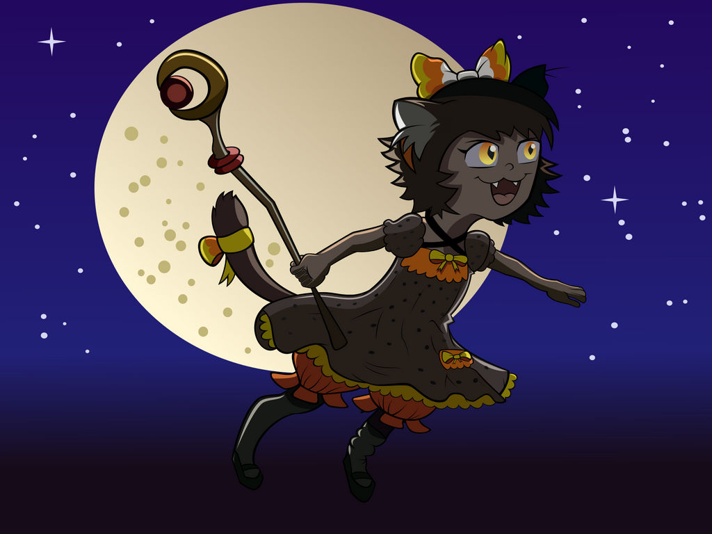
A shaded vector pic of her little candy corn cat-girl, Risa, enjoying the night.
Hey, I'm from ProjectComment ! ^^
Firstly, I love the whole idea, being up in the sky against the moon as a backdrop. The composition is very nice and works well together with the placement of the character partially over the moon but not covering the entirety of the edge. The pose in conjunction with the background works well as there are no visual tangents and it's clear what is taking place in the image.
Your line work is nice and clean, effectively defining the character and details apart from each other. The pose is a little stiff, but that comes with practice. If you're not already, use photo references when drawing (especially) figures. You might be surprised how much they can help you improve. This is true for better learning folds in clothing as well. Even when simplifying something, like a chibi for example, it's extremely useful (and imperative) to use references when drawing so a feeling of simplified realism is still conveyed. That's what makes many professional cartoons look amazing. They're simple, and not realistic per say, but they still have the necessary details to illustrate the concept or object.
The arm holding the staff is a little awkward. With the current position of the staff, her fingers would more likely be facing the camera rather than the back of her hand. If you want to keep her hand turned downward, you would need to foreshorten the staff with the top of it receding back toward the moon and turn her hand slightly so it doesn't feel so forced to keep the bottom of the staff in front of her. Now, doing that would change the silhouette of the girl, so it might be better overall just to turn the hand so the fingers face the audience, because the current silhouette works really well.
Also, keep in mind when drawing a character to think of their face as a sphere. This will fix your current feeling of the eyes being off. If you look at a ball, say a football (or soccer ball depending on where you're from) and see how the black hexagons get distorted as they move around the side of the ball away from your eyes. The same concept is applied to cartoon characters as well. Establish a mid-dividing line so you know where the nose goes, and as what distance to place the eye(s). Think 'cartoon character drawing book'. They usually break an image down with divisional lines to help establish where details should go. It may sound simple, but it helps tremendously to preserve a roundness to the character.
The colors work nicely together. Something you might consider doing in the future is to completely desaturate your image temporarily as you're working on it to get an idea of how the values are working together. As it is, a majority of the values fall in the mid gray range with the exception of a small few that are a little darker or lighter. Remember, the scale is 1-10, so try to use all of the values, not just 3-8. ![]() The moon is one of the most obvious bright parts of the piece. As KCHuang suggested earlier, you could try lightening the sky since the moon is your primary light source, and maybe even punch the moon up brighter as well. Doing this would help your character stand out even more and help increase the over all visual aesthetics.
The moon is one of the most obvious bright parts of the piece. As KCHuang suggested earlier, you could try lightening the sky since the moon is your primary light source, and maybe even punch the moon up brighter as well. Doing this would help your character stand out even more and help increase the over all visual aesthetics.
You're doing well, and looking through your gallery, it's apparent that you're improving. Keep at it! ^^